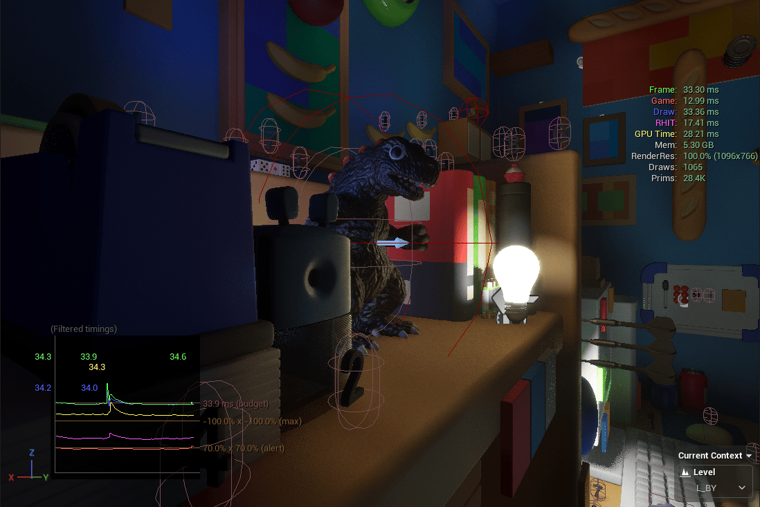
The development goals for this month (creating the system menu and main menu) have been successfully completed.
And since they were finished earlier than expected, it turned out to be a very productive month in which I also managed to work on things like NPCs, capture fixes, and several other tasks.
●NPC
Let’s start with the NPC monster.
I made a short timelapse showing the modeling process, so here it is:
The workflow was: modeling in Blender → texturing in Substance Painter → rigging in Blender.
Both the modeling and retopology were done using only standard features.
I may switch to Retopo Flow later, but for now I’m keeping it on hold.
Speaking of which, I recently saw news about an AI that can handle retopology at a practical level.
Most people hate retopo, but I actually kind of enjoy it, so it feels a bit bittersweet.
Of course, I could keep doing it manually, but that would make me the “slow worker”…
Looks like I’ll be saying goodbye to retopo soon.
For rigging, I used Auto Rig Pro.
It adds a few unnecessary bones, so it’s not ideal performance-wise, but building a rig from scratch would take too much time, so it’s a trade-off.
After all, there are over 20 NPCs planned, so efficiency is crucial.
For weight painting, I used Handy Weight Edit.
Personally, it’s an essential add-on. I can’t do weight painting without it anymore.

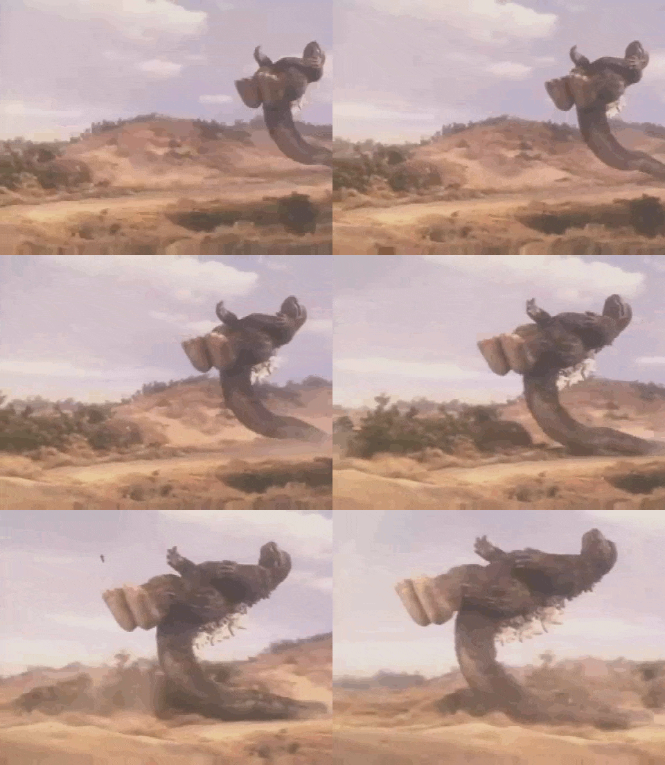
This is the reference 2D sketch.
Normally, I would finish it with colors and details, but this time I already had a fairly clear image in my head, so I just stopped at the thumbnail stage.
Whenever I skip the detailed planning like this, I always end up fumbling later.
To all sculptors out there, make sure to plan everything thoroughly before jumping into 3D sculpting!
●Main Menu
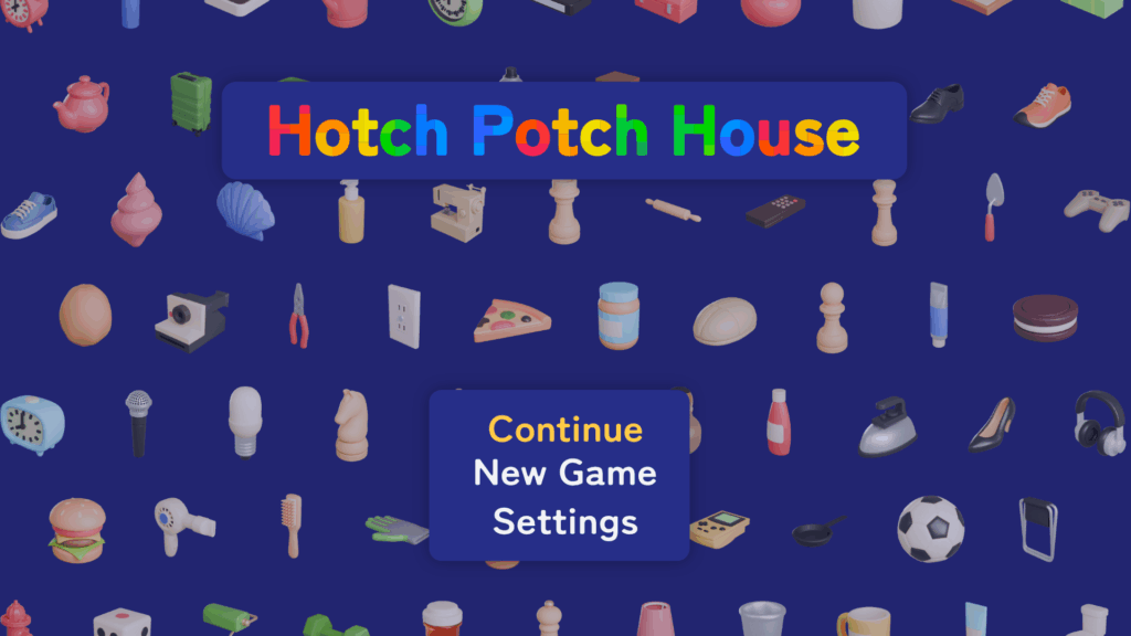
I created a mockup for the main menu.
When designing UI, I always start by checking how other games handle theirs, using the popular site among game developers.
Main menus tend to look quite similar across titles, so for HPH, I wanted something that stands out at first glance.
And here’s the mockup I came up with!
…
Well… I suppose this is fine for a first attempt.
For now, I decided to go with a design-oriented direction.
But on second thought: “Wait a second. If the atmosphere is the most important thing of HPH, shouldn’t the menu reflect that?”
And that led to the second version!
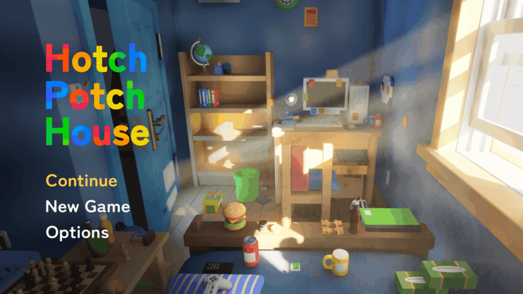
The images will, of course, be replaced later, but the layout and overall direction feel right.
I’ll probably stick with this.
…In the end, it ended up looking similar to other games anyway.
By the way, the large set of icons used in the first draft were automatically rendered in Blender with a custom batch-rendering set up I made.
I thought they’d go unused after the redesign, but they ended up being repurposed as the background for the system menu.
●System Menu
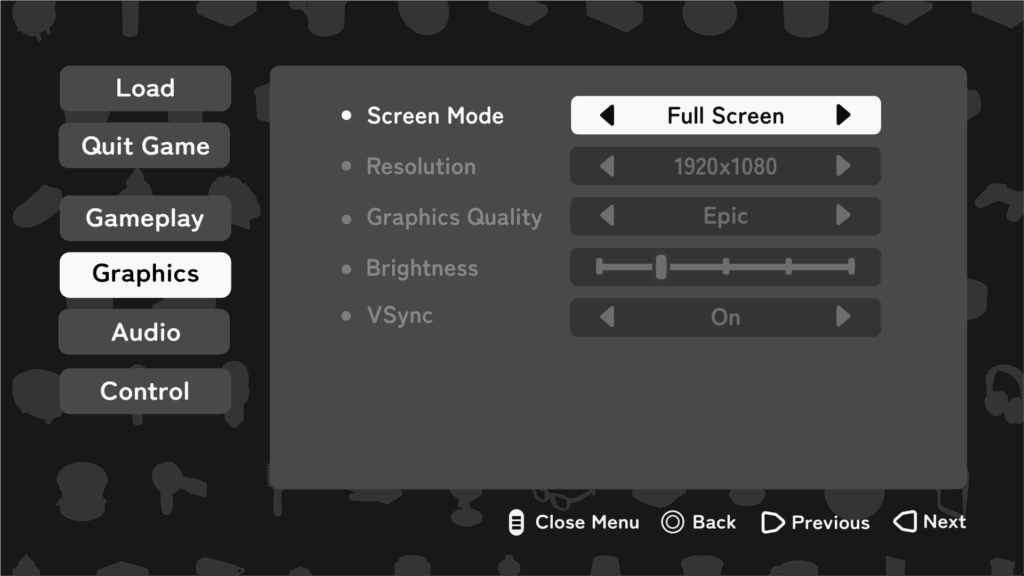
And this is it!
Not bad at all.
So far, only the brightness adjustment is functional, but when it comes to the settings menu, the difficult part is just the UI creation.
After that, it’s incredibly simple since all that remains is using the built-in Unreal Engine nodes like “Set Screen Resolution” or “Set VSync Enabled.”
It’s almost just a matter of dropping them in.
One element I personally like in this menu is the input guide placed at the bottom (“Close Menu,” “Change Value,” etc.).
These icons automatically switch depending on the type of controller being used (PC, PS, Switch 2, and so on).
There’s the same feature in the Common UI plugin called Common Action Widget, but its downside is that you can’t customize the button style.
Since I wanted to use different button styles between the game menu and the system menu, I decided to build my own from scratch.
Here’s the game menu, by the way.
You can see that the button style displayed at the bottom differs from the one used in the system menu:
Of course, I also made a mockup for the system menu before starting full production.
●Hang on Ledge
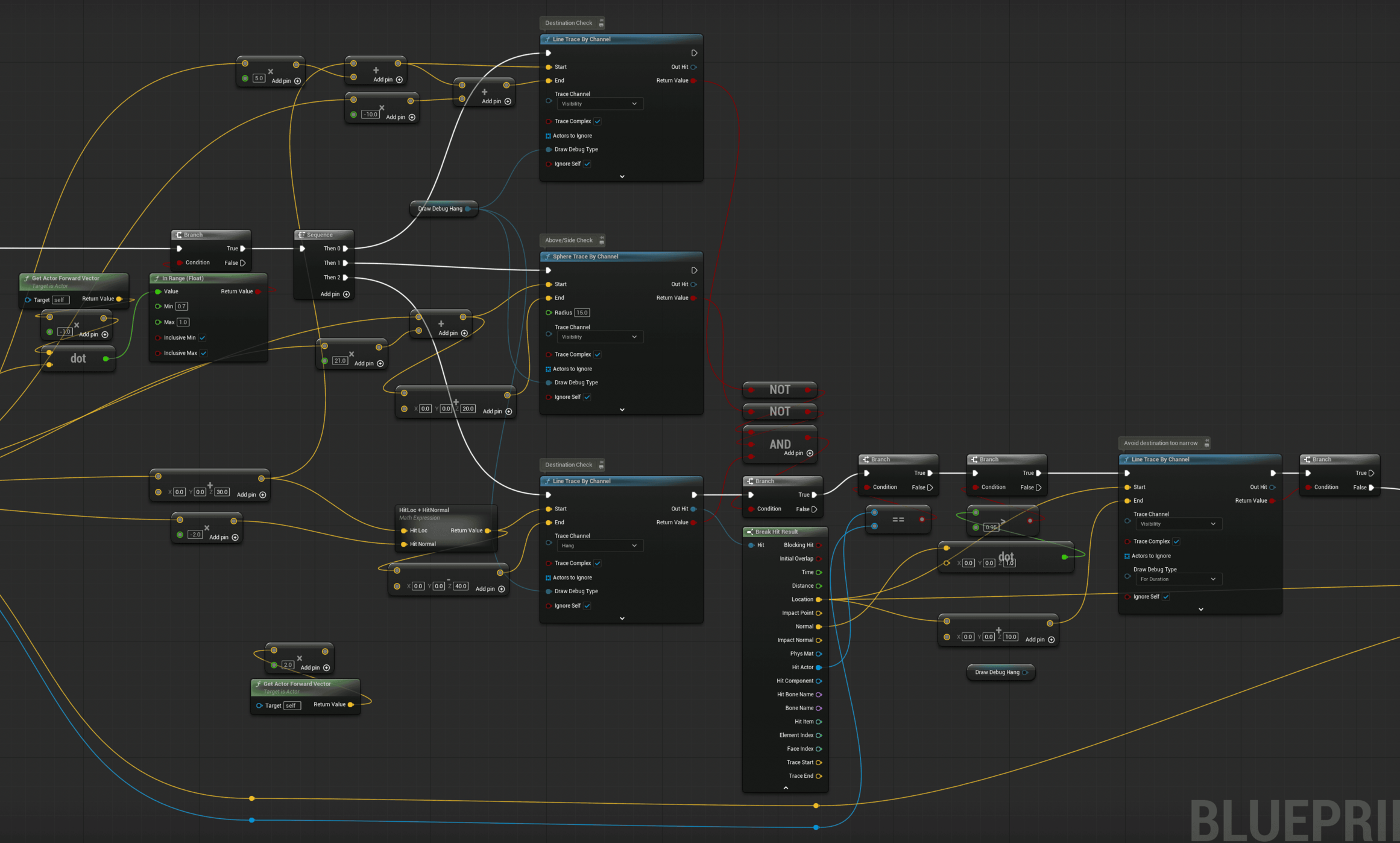
I made major adjustments to the climbing logic and animation.
In fact, the previous version wasn’t functioning at all, so this was essentially a full rebuild.
The key improvements are that the character now follows curved surfaces and that the travel distance can be adjusted based on how much the analogue stick is tilted.
For the Root Motion, I used the Motion Warping plugin to make it dynamic.
Actually, I always use this plugin whenever Root Motion is involved.
It’s far more flexible to modify things directly through Blueprints than to bake everything into the animation.
As for performance, there’s been almost no noticeable impact so far.
By the way, the code looks much cleaner now too.

●Level Design
I recently discovered a powerful plugin called MeshPack, which prompted me to rethink my level design workflow again.
The plugin gathers all Static Mesh, ISM, and HISM actors in each level at build time, and merges identical meshes into instances of a single ISM.
There is a common argument that ISM is unnecessary when you have Nanite, but CPU cost from a large number of actors still exists even with Nanite. So there is still a clear benefit to instancing.
In short, this plugin can deliver significant performance gains.
There are downsides.
Any asset that contains logic, including Construction Script, is excluded.
That means all my carefully built “placement” Blueprints are out of scope.
Do I minimize Blueprint usage to maximize MeshPack’s effect?
Or do I keep my placement workflow and accept the overhead of placing and adjusting actors by hand?
Should I write a custom placement Editor Utility Widget instead?
These thoughts keep bouncing around in my head.
If this were an ordinary plugin, I might pass.
However, the author, Tore Lervik, is an engine contributor and the developer of MeshBlend, which is also excellent.
That gives me confidence.
Support is solid as well. I asked on Discord about Blueprint compatibility and got a reply the same day.
Given all that, I have been genuinely torn.
Update before posting: I decided to proceed with a hybrid approach🎉
●Others
On October 30, the Affinity suite was unified into a single application and made available for free.
Before the announcement, most people were expecting something negative, but once it was revealed, it turned out to be surprisingly positive.
Personally, I’m very happy about it, having unified functionality and UI across the suite is a big improvement.
However, looking at the YouTube comments under the announcement video, it seems many users didn’t take it as positively.
Some are convinced that Canva (,which owns Affinity) will eventually switch to a subscription model.
I’m not so sure about that.
I actually trust Canva quite a bit.
Watching interviews with the CEO, I get a similar impression to Bluesky’s Jay Graber, someone who gives you the sense that “as long as this person is in charge, things will be fine.”
(That said I’m all for Mastodon when it comes to social media.)
So for now, I plan to keep using Affinity.
Oh right, I canceled my Adobe subscription just last month…
●Next Plans
By the way, don’t you think this month’s blog came out unusually early and feels more substantial than usual?
Up until this blog, I had been starting to write near the end of each month, like a fifth grader scrambling to finish their summer homework the night before school starts.
But this time, I actually began around the 15th, full of determination.
Still late?
Fair point. I’ll do my best.
That said, November will probably be quite busy with work, so I might not have much time for extra progress.
Maybe there’s no need to start writing too early after all.
According to the yearly plan, finishing even one enemy character this month would already be good enough.
Still, writing a blog post about just one NPC wouldn’t make for much of an update.
So I’ll drink a red bull (no I won’t) and make sure there’s enough progress for one solid post.
Which means, in the end, I’ll probably need to start writing early again after all.
Anyway, I’ll stop here for now and get started on next month’s post. See you then:)